
NEWELL BRANDS
Brand-Agnostic Website UI/UX Design
Newell Brands is a manufacturer and retailer of consumer goods and is based in the United States. The company’s portfolio of well-known brands includes Rubbermaid, FoodSaver, Calphalon, Sistema, Sharpie, Paper Mate, Dymo, EXPO, Elmer’s, Yankee Candle, Graco, NUK, Rubbermaid Commercial Products, Spontex, Coleman, Campingaz, Oster, Sunbeam and more.
31,000 employees
$14.74 billion in revenue in 2017
Project Overview
The Digital Leadership and Product Team at Newell Brands launched the Account Ease Initiative to increase memberships across their various e-commerce websites. In addition to driving loyalty, account memberships help the business gain customer insights.
The user experience goal of this initiative was somewhat broad and encompassed several features and deliverables. The product brief included making the sign in, account creation, and rewards membership process seamless and easy for the customer as well as discovering and removing unnecessary steps and experience friction. Also, we explored ways to increase sign ins before and during checkout. Both basic and rewards membership levels come with benefits. The project scope also included highlighting and communicating these benefits. The overall user story guiding this scope of work was articulated as “becoming and being a member is easy.”
Areas of Focus
Shopping Cart
Checkout
Modals
Account Login
Order Confirmation
Reset Password
Rewards Dashboard
Account Dashboard
Success Criteria
Sign-in Completion Rate
Bounce Rate
Checkout Completion
Loyalty Opt-ins
Account Creations
Email Subscriptions
Scopes of Work
Sign In With Social Media (and corresponding checkout e.g. Google Sign In / Google Pay)
Passwordless and Magic Link Sign In (Request sign in link sent to inbox)
Account Creation / Sign In Modal (can be used from any site page)
My Role
I was hired as a fulltime contract UX Designer for Newell’s brand agnostic website platform that supports their large portfolio of well-known brands. The user experience team includes 6 designers and 2 researchers. We collaborated remotely on Slack, Microsoft Teams, and Figma. We used FullStory and Google Analytics to gain insights into website user behavior trends. We also ran A/B tests with a suite called AB Tasty. In addition to this, we conducted user tests on a crowd sourcing site called usertesting.com. I built mobile and desktop wireframes and prototypes for all of my designs in Figma.
Competitive Analyses and Opportunity Mining
After receiving the brief from the Product Team, I met with the research team (UXR) and with the other designers. The product and experience teams each had previous research that they shared with me that included concepts for a modal component for signing in and creating a new account as well as passwordless sign in.
I reviewed several sites within the popular e-commerce space and documented account experiences around the scopes of work (account modal, passwordless sign in, rewards benefits and sign up). I found that Ikea and Home Depot had the best passwordless experience and Ikea had a clever way of presenting rewards membership benefits. I used elements from both of these experiences in my designs.
I reviewed and documented account experiences from the following sites:
Nike
Walmart
Home Depot
Adidas
Puma
Patagonia
LL Bean
Land’s End
Warby Parker
Canva
Air BnB
Baymard Research
Newell Brands has subscription to Baymard's Experience Research Database. I searched through their site for content pertaining to Account Ease and we found several articles and studies. Together with the research team, we documented the data we found and shared it with the team to prioritize actionable design notions.
Customer Support Team Interview
The design and research team met with the customer support team and we asked questions around the feedback they have received from customers regarding their experiences with signing in to their account. They also shared data from their management dashboard of documented customer feedback.
Lightning Demos
On a live recorded Teams meeting, I managed a lightning demo wherein we solicited comments and feedback from a large group of Newell employees of sites they use and/or liked the account experience. Attendees pasted screenshots of their experience into a Figjam board and one by one each walked the group through their feedback.
Ideation Design Phase
I spent a month or so with the Research, Stakeholder, and Product Teams ideating around various wireframe flows that incorporated different ideas that we were having based on the research, lighting demos and competative analyses.
User Testing
We used a crowd sourcing site call UserTesting.com to run tests from the site’s wide offering of user types. I created a test for the account modal and rewards designs and submitted it to the platform. We were able to watch the users. use the prototype and listen to their commentary as they talked through the experience of using the prototype. We used clips from the video for sharing with stakeholders when we presented our findings.
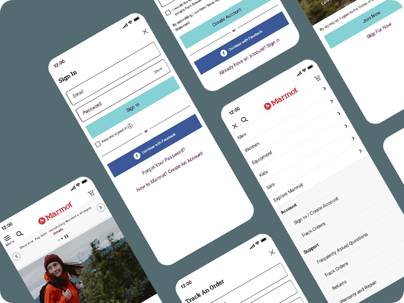
Deliverable Feature 1: Progressive Disclosure
To avoid the complexity of the current account creation screens, we introduced the concept of progressive disclosure which means feeding the user one step at a time rather than displaying the entire form all at once.
Deliverable Feature 2: Account Modal
We proposed introducing a modal that could pop up on any page or place in the shopper’s experience without disrupting their progress and sunsetting the dedicated sign in and account creation page and tabbed component.
Deliverable Feature 3: Passwordless
We proposed introducing an option for the user to sign in without a password. We believed this would accomplish our success criteria as users often have trouble remembering their password and often experience friction and frustrating having to reset it.
Deliverable Feature 4: Highlighting Rewards Benefits
I designed new and more visual screens that highlighted the benefits of becoming a rewards member during the process of creating a new account.
Accessibility Standards & Training
Our team received several days of training in accessibility compliant design. We also had a team member that specialized in accessibility to whom we deferred to and shared our designs with for approval.
Getting Stakeholder Buy-In: High Fidelity Prototypes, Deck Design, and Presentations
I built high-fidelity prototypes in Figma for 320 px wide mobile screens, 320 px wide mobile screens, and 1600 px wide desktop screens, representing the smallest mobile screen size, the most common mobile screen size and the largest breakpoint for desktops.
Newell Brands owns several brands and each has their own corresponding site. But they all are on top of the same brand-agnostic white label platform. I built the prototype designs using the Marmot.com Design System and content for presentation purposes.
Dev Handoff: Whitelabel Versions of Figma Designs
Our development team at Newell needed Figma files designed to a brand-agnostic white label design system that had built in cues for color and typography styles that corresponded to each brand. After the presented prototype was approved, I had to update the Figma files to the white label design system.
Measuring Success
As of the date this is being written, we have not implemented or launched any of these designs yet. The plan is to AB test the new designs against the old ones and track engagement and success numbers.

Josiah holds a Certification in User Experience Design from Massachusetts Institute of Technology